Posts

Showing posts from April, 2016

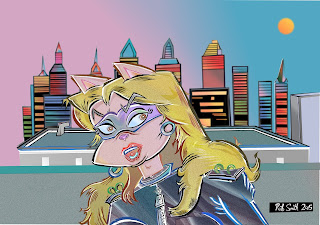
Masked Vero Elements

Image
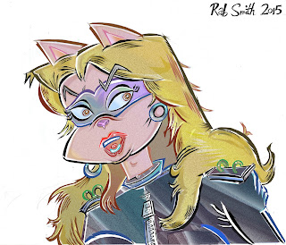
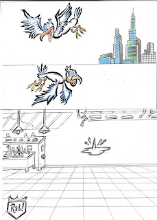
THE VARIOUS DRAWING ELEMENTS required for the recent 'masked Veronica' cartoon are stored here as per usual. The backdrop of the cityscape at night  turned out OK: I usually avoid consulting Google Images, but I did use them in this case: I saw a night photo I liked then memorized it, rather than turn out a straight copy, which I have never enjoyed doing. I also visited four United States cities relatively recently, so I got a good look at their stunning architecture. Their love of neon-lit cityscapes seems only topped by the Japanese. TRICKS OF THE TRADE: The skyscraper elements were blown up from a half-size [A5] pencil rough, which usually works better for me personally: just easier to control . The colored lights were 'inverted' in negative color, then reversed back again, so I could get  a colored glow effect in front of a desired matte black background representing the rest of the building. The drawing of buildings is a subject not especially enjoyed by many artis

Veronica Overkill

Image
TODAY'S ENTRY is my first polished rendition of cat-babe Veronica as seen in her night-time Crime-Fighter attire: this sort of imagery is heavily influenced, of course, by cultural icons as diverse as the 60s Emma Peel character from British TV, and more recently I have been happily devouring the almost-entire back catalog of the American  D C Comics character CATWOMAN, which contains a lot of really stunning artwork. If my entire concept of Veronica was simply as the night-time crime-fighter as depicted here, this material would have been unacceptably derivitive: but as it stands, this is basically just intended as an occassional 'running gag' within the B. Boomer format, and should be treated as also-ran minor diversion. Looking at this again with a fresh eye a day after adding, it strikes me there is something of a BEWITCHED 1960s animated opening credits sequence about this one! Ah---NOTHING is really original any more, now, is it?! Enjoy!

Pretties For You [Too]

Image
MORE SHAMELESS filling-up-of-space, however I love showing all these seperate drawing elements in isolation. TRICKS OF THE TRADE: Once you get the hang of this digital tomfoolery, the artist can start mucking about with scale, which is always great fun, if usually more time-consuming. In the case here, the bed [very easy to draw] is in actuality around   four times smaller than the figure of Veronica. So in essence, the bed element is 'blown up' and the much more complex rendition of Vero is actually 'shrunken down'. This all may sound quite complicated but it's just a case of visualizing how the seperate bits go together. As I have made plainly evident on here, the effective drawing of attractive women is often not even attempted by many name professionals, and the examples I see by established veterans of cartoonery are mostly so-so or more often just  plain hackneyed. There are a lot of very good specialists in drawing girls though: see some of the excellent spee

Pretties For You

Image
PRETTIES FOR YOU    was the title of a pre- SCHOOL'S OUT album by Alice Cooper, a name  which I have happily half-inched, for the purposes of heading this latest posting. Really, this is just the latest excuse for me to exhibit more artwork components, in 'loving Technicolor' Detail'. Revealed this time: how cat-babe Veronica was put together using seperate pages of artwork [not as difficult as it may sound] and note how her head is shrunken down from the original drawing. TRICKS of the TRADE: ------ To save time, the picture frame around B.Boomer himself was digitally copied from another drawing of one, however the copied frame has been squeezed, shrunken, rotated and colored different. Also, see how the three characters in their frames are originally drawn larger [more room to draw in, for a nicer job]: then afterwards they too are shrunken down and repositioned for a more pleasing effect. FINAL ILLUSTRATION:    the core elements are simply roughed out on recycled pap

Sexism-A-Go-Go [2]

Image
SOME READERS OF THIS SITE may well have noticed that I have something of a penchant for drawing 'sexy young ladies', ---and this is true: I reckon women just look good and are naturally great subjects for inclusion in my cartoons. Drawing guys is OK, but the pneumatic, aerodynamic composition of the female form is a much more attractive prospect, for all sorts or reasons. Drawing male characters is just so over-familiar and overdone, I often switch over to sketching ladies: men look boring, they are shapeless blobs in comparison. As much as I love drawing this sort of thing, in today's Political Correct , over-analyzed social climate, the commercial opportunities for selling this sort of thing are dwindling away like much else in cartoonery..........there was a US strip by Frank Cho I liked, called LIBERTY MEADOWS which was brilliantly drawn, however it took a lot of flak from feminists who decried a sexy young lady character [not unlike the sort of thing I have done seen h

odds and-------oh, sod it.

Image
More storage of my  silly artwork: seen in bits and pieces like this, they are somewhat reminiscent of the cut-out approach used by Tezza Gilliam in his Monty Python TV animations. FLYING BIRDS ; I am happy to draw them, however, attempting to add these at 'actual size' I find pretty difficult---just so little room to work in------ so I almost always draw them larger,  then shrink 'em down: minute-scale birds never seem to come out very satisfactory otherwise. Most other subjects I don't have this problem with, but feathered boids are especially delicate. ALSO REVEALED:     how I edit below-par character poses, and still use them,  without throwing away the entire drawing!!!!!  See cat on spike for an example of this: this approach is  used sparingly, not frequently, I may add!!!!!!

Redux DeLuxe

Image
I OFTEN BEMOAN what I see as the 'sterile' and 'inhuman' processes of digital cartooning, but there is no doubt that the digital paintbox is capable of limitless wonders. The original version of this cartoon was fine, but I felt it could be adapted/improved further. ABOUT THIS DRAWING: I wanted to increase the sense of peril and danger in this cartoon, and really it is just a case of altering the scale on a couple of elements, in this case 'shrinking' cool-cat Jet Blanc down to more insignificant proportions, which of course meant I had to rescale the two seagulls accordingly. Obviously, the best way to get any sense of giant scale in drawings of statues requires character-comparison.....I visited the REAL Statue of Liberty in Nov 2014, and the actual structure is not as large as some imagine....still pretty darn impressive,though..........

New York Stories De Luxe

Image
NEW YORK STORIES, part 7: Up until now, all cartoons in the NEW YORK STORIES sub-series contained quick-time rough sketches only, which were almost all done during my time in the Land of Unca Sam........I have exhausted all of the material I actually drew there, but I have decided to continue with cartoons inspired by sites and sounds I encountered over there....... THIS ONE HERE sees the first full-blown, polished job done using this approach: 

Flytoons: bits-n-bobs

Image
FOR STORAGE PURPOSES: -----close-ups of the recent FLY characters NEXT UP:     More of the Usual Gubbins

THE FLY: Alternate Take

Image
WHEN I FIRST STARTED using digital alterations to my cartoons, I was satisfied with just coloring in basic images: in the early days, this was achievement enough....human nature being what it is, of course, means experience and confidence usually results in trying out ever-more ambitious images, and most recently I have been mucking about with different background plates, often adapted from the same image. I done TWO seperate character poses of scientist-gal HELLEYNE, as I fancied putting in a Tex Avery-like 'take' for her reaction to the vast Mega-Fly emerging from the Teleporter [ wouldn't YOU act surprized at such an outcome?! ] so I  done a seperate composite, with 'cooler' background colors. The entire background plate images are also recorded here. BOTTOM IMAGE: the entire background elements were simply sketched, half-size, on the bottom half of a scrap of used A4 paper---in fact, I often get two different background elements on the one sheet, as seen here. I

THE FLY: Terror-Portation

Image
THE FLY is easily my most striking-looking concept: even the most in-your-face aspects of the BOOMER crowd shenanigans read as mild and retrained, at least in comparison to the repulsive spectacle sometimes seen within my science-fiction themed satirical INSECT  concept. IS there any commercial appeal within the FLY concept though? It's clearly hard-hitting visually, but perhaps the sheer repellent subject matter of gross insect-human mutation is just too off-putting and repulsive  for casual comics-readers?  Yes, many character designs seen in contemporary graphics are deliberately off-putting, but even allowing for this, THE FLY is gross-out....by ANY standards.  There is also the 'small' problem of 20th Century Fox owning the FLY legal rights:  I have to look into this one, or adapt/introduce new characters to alter some of the inspirations. No matter, THE FLY is exactly the sort of thing I was looking for, for a long time. Some good did indeed arise from the otherwise u