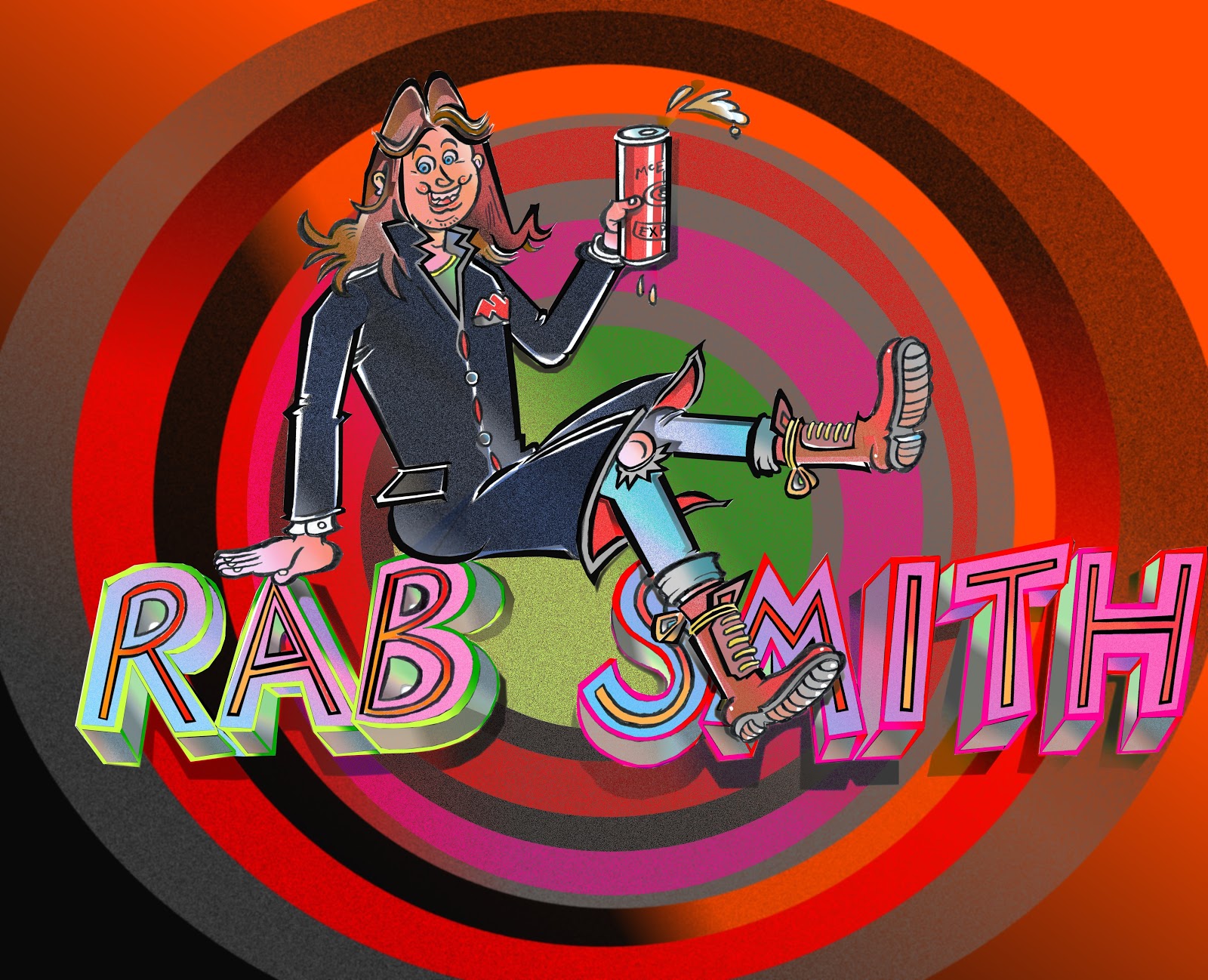
'Unoffish' LOGO update:
FOLLOWING THE RECENT addition of the 'RAB SMITH' 'official' logo ----which was actually finalized by sheer accident------I was mucking about with shifting lettering around, and I ended up being quite pleased with the result---although it wasn't exactly what I set out to do--it was a real 'happy accident'.
No, the following imagery was the intended result, and although this version hasn't quite made it to 'officialdom', it's an interesting relic [hopefully] that is based on my appearence as a youthful lout [I wasn't a lout really, at least I hope not]----but yes, this is how I dressed at leisure in the very early 1980s:
A mere couple of months ago, I simply never had the know-how to put together material like this, but it finally seems to be coming together; quite simply, it's done like a composite, here's the central image in isolated format:


Comments
Post a Comment