Logo A-Go-Go [2]: S.H.I.E.L.D.
OK, Don't say that I don't serve you up diversity, readers!:
My earliest successes using digital color involved creating cartoon logos [see earlier entries on here, circa 2011] and so after a long absence on this score, I have returned with this all-new satirical version......clearly based on a very well-known major movie studio logo [no, not 20th Century Fox!]
No reference pictures of any kind were involved in creating this, I am happy to report---also proof, if it were ever needed, that you do not need expensive gear to do imagery like this------all I used here was:
recycled sheet of A4 paper [cost: zilch]
ancient 4H pencil, the same one I have created hundreds of drawings with
BIRO BALLPOINT PEN: 25 cents
FREE GIMP digital manipulation service: does over 90 per cent of what Photoshop does
-The only 'real' cost was the electricity required to power the computer.
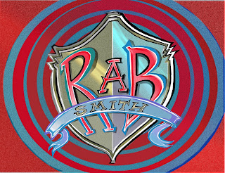


Plate One: the finito version
Plate two: the basic design after correction and cleanup
Plate Three: The original sketch without which none of the above would have been possible. The letter 'S' is the hardest of the alphabet to get right, hence the replacement struck here.
My earliest successes using digital color involved creating cartoon logos [see earlier entries on here, circa 2011] and so after a long absence on this score, I have returned with this all-new satirical version......clearly based on a very well-known major movie studio logo [no, not 20th Century Fox!]
No reference pictures of any kind were involved in creating this, I am happy to report---also proof, if it were ever needed, that you do not need expensive gear to do imagery like this------all I used here was:
recycled sheet of A4 paper [cost: zilch]
ancient 4H pencil, the same one I have created hundreds of drawings with
BIRO BALLPOINT PEN: 25 cents
FREE GIMP digital manipulation service: does over 90 per cent of what Photoshop does
-The only 'real' cost was the electricity required to power the computer.


Plate One: the finito version
Plate two: the basic design after correction and cleanup
Plate Three: The original sketch without which none of the above would have been possible. The letter 'S' is the hardest of the alphabet to get right, hence the replacement struck here.


Comments
Post a Comment