Posts

IPC REDUX

Image
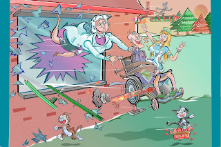
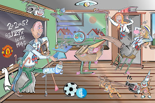
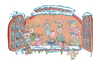
THIS ITEM was a one-off, fairly elaborate Christmas-themed item in which the criteria was to recreate the ambience of the late 1960s/ very early 70s humour comics put out by IPC/ Fleetway---you know the sort of thing if you are into this stuff: Whizzer and Chips, Cor!!, and many more. ---in other words. 'no outright copying of established characters ' but I had to put over the basic ambience for them. Great fun, though clearly, this one took a fair bit of time to put together. RAB L RAUSER  L RAUSER 

Snowbound in Situ

Image
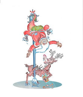
THESE IMAGES WERE GOING TO BE KEPT IN 'DEEP FROZEN' format until next year: however the ultra-rare freak weather we are experiencing at the moment perhaps makes these items more appropriate: I drew these for a large-scale composite in summer 2017. RAB L RAUSER

Dredging up the past

Image
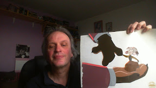
TODAYS' ITEM is very different from the usual shenanigans, however , for better or worse----it qualifies as part of my 'cartoon past' at least in terms of employment. This is me sitting at my drawing desk holding up an acetate cel from an animated feature I worked on, it was called AMERICAN TAIL 2: Fievel Goes West, and it was put together in London in the very late 80s and early 90s. Not a happy time in my life [it could have been, had I been given the freedom to be let loose on my best stuff] it nevertheless provided me with work in a field I had a deep interest in, in fact we were working up to 70 hours a week in an intense London heatwave in the Summer of 1990. I refrain from putting on any of the  frames I 'drew on' from this film, on the grounds the system of making these animated works rellies too much on the layouts and control of other artists: this has got absolutely nothing to do with my usual approach to cartooning, where I often bear responsibility for ...

Chooks Synonymous

Image
TODAY'S ITEMS are further excursions into ' REPEAT BUSINESS' territory: a customer returned to me a good bit later with more requests for cartoon chicken illustrations to decorate his website. I am quite happy to do this sort of thing: it means I sit there and come up  with designs almost as if I am creating characters in an animation studio: no complaints from me on that score. My earlier cartoons on this subject were of the older-school, bottled black  ink variety, and here I would say my technique is a lot more 'modernized' although at the heart here we have very traditionally-looking character designs. The pencil on paper early stage is still the best part to me, though! RAB L. RAUSER

Nurseula Undress

Image
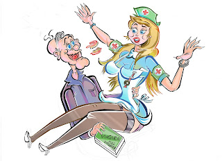
THE PROBLEM WITH utilizing composites made up of different drawings---as I use for almost all of my finished-quality cartoons these days----is that a lot of fine detail can easily get lost when the shrunken-down elements are all put together. The polished effects are better seen in 'loving close-up', and here is a prime example. Striking the right balance in putting these images together usually means trying to avoid spending time on details that will be rendered near-invisible at the end of the task. ON A BRIGHTER NOTE: ---At long last, I seem to have finally shook off the heavy Barrie Appleby influence [ Barrie drew Cuddles and Dimples for DANDY from the mid-80s onwards  ]     as regards the depiction of the 'sexy blonde nurse' as seen below. I do like to think that the design of the nurse here is a Smith creation through-and-through, or at the very least I am free of ape-ing the style of another artist----that was the intent here, at least. Barrie's work was tops...

Repeat Business [3]

Image
TODAY'S ITEM is the fourth---and last, to date--------customized tailored caricature job I got offered by a kindly gent who liked my stuff enough to ask me back a few times. Great fun as usual and again I liked to do it in  fairly elaborate technique-style. Also contained below: not-quite-finished artwork [complete with image underneath burning through] , the original rough sketch required to 'sell' the proposal, and other miscellanea. Enjoi! RAB L. RAUSER 

OfficeToons in Continium

Image
THESE TYPES OF WORKS turn up relatively frequently: office workers in search of one-off graphics required to illustrate their talks to the group. I often use these opportunities to capitalize upon my tastes for drawing female characters: I must have drawn thousands of pro-level ladies in my time, I never tire of this subject especially. These items had to be knocked out quickly, I recall, but the buyer seemed pleased with the results. MORE OT THESE LATER, they crop up a fair bit RAB L RAUSER

A Few of my Favorite Things [to draw]

Image
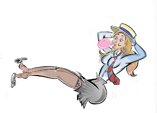
HERE'S A CLOSER VERSION of one of the female characters I designed for the previous caricature featured on this site: I am adding it in because sometimes a lot of the detail gets lost in some of these more elaborate works, once the various elements get shrunken down and re-assembled/ I have never hidden the fact I LOVE drawing attractive young ladies, and I would be more than happy to pack every other subject in, and just stick to this theme exclusively. It's very easy to get carried away drawing sexy subjects, and restraint is most certainly required drawing up this theme, if the artists wants to avoid lurid sensationalism. More on RESTRAINT and how it can seperate the men from the boys later. ABOUT THIS DRAWING:  I am well aware the schoolgirls' shoes look a bit small for her feet but this one is a reference to how your feet swell later in the day: and also WHY she would want to remove her shoes. HOWZAT for attention to detail, readers!!!! I enjoy drawing MOST subjects, b...

Repeat Business [2]

Image
2017 witnessed my richest harvest---thus far----of tailored caricature: this was work that just happened to come along and I keenly accepted it. I work from good clear photos to get a resonable facial likeness. This one is more than likely my most elaborate example of this type thus far:  the customer seemed pleased with it and more got ordered. VERY disciplined from my point of view: RAB L. RAUSER

Unfinished Sweet

Image
IT'S NOT TOO OFTEN I manage to secure work from my native UK these days, but this one was a rare example of such an excursion. A sweet/ confectionary manufacturer in the North of England got in touch with me after they were searching for old-school cartoon graphics [apparantly it wasn't too easy to find someone suitable for the job, or so they confided] . More of this imagery coming up on here shortly, but today at the time of writing being the 23rd of December 2017, means it is as good a time as any to add on this wholly festive image onto this site. I think this image may have ended up on the confectioners' website, but I really have to check. Also below: early rough layout/ tryout shetches. RAB L. RAUSER

Christmas Wonderland [2]

Image
THIS ONE represents yet another out-of-the-blue commission, typical of the sort of thing  which has kept me busy for most of this calendar year of 2017. A customer looked thru my visuals and felt I might be the right chappie to construct a festive image of his childhood memories of the old British  IPC comics like WHIZZER and CHIPS , COR!! , Shiver and Shake, etc etc, which peaked from the late 60s to the mid-70s period especially. Sure enough, a lot of the style I draw in today naturally springs [at least in part] from the apex of olden-style UK funnies-comics, : I never realized it at the time, but all that endless hours of poring over such material in childhood was subconciously being filed away in my memory banks for storage and  future reference  , without me even realizing it---I kid ye not!! First time around, I most certainly preffered the more traditional comics fare from D C Thomson:  IPC/ Fleetway were a more noticably 'chuck-everything-at-the-wall-an...

'Hey, Keith......'

Image
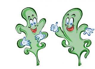
'Hey, Keith!-----AAAAAAAAAAAAAAAAAAAAGHAAAAAAGH!!!!' The above primal scream was the opening introduction to the track I FEEL ALRIGHT, a cover of an Iggy and the Stooges tune, that features as a closing song on the debut album by early, first-generation punksters THE DAMNED ALBUM:  DAMNED DAMNED DAMNED, catalogue number SEEZ1, Stiff Records, early 1977, the first bona-fide UK punk album, pre-dating both the Pistols and the Clash. This platter is still more than likely my favorite single studio album put out by anyone ever, and it most certainly was in my mis-spent youthful days. Anyway, I have used this snippet of Damned song intro to usher in my winning design for a recent customer, a very straightforwards, very commercial interpretation of a character dreamed up by another dude, but I was given free reign to draw it how I wanted, which is always a nice route from my point of view. Meet: KEITH THE LEAF, a copanion piece character to good old RONALD RAINDROP.

POLITICOS [2]

Image
IN MY 30S, I spent a bit of time trying out political caricatures [I have a fair few of these try-out designs as yet unscreened on this site]. Back then, print was still king, and internet access  for all was still a long way off---at least it was so  for me, as  I was pretty late  in getting a computer, in fact it was 2007 when I finally got online. It was really tough trying to get into the Political Caricature Market back then: I did get some interest from the London Evening Standard newspaper who most certainly encouraged me. I had no problems thinking up silly ideas or lampooning politicians and it was a field I could have quite happily  taken to, had the opportunity and encouragement been there. As ever, I moved onto other styles of drawing, however although I lost interest due to no openings becoming availible to me in the 90s, the advent today  of the Internet offers up work opportunities  for me to do this sort of thing. Here is another pretty...

Repeat Business

Image
NO, THE TITLE ABOVE is NOT a reference to any trip to Amsterdam I may have considered, but more of a depiction of how more work can generate from the same customer[s] if your cartoons are deemed good enough. LAST POSTING, I added in fairly sketchy-but-acceptable 'office toons'  but to be honest, I much prefer doing more accomplished work that clearly takes considerably longer, here of course it all depends on the payment of the job making it worthwhile to embark upon. I have done a fair few of these works now, with more similar themes in the pipeline.  DIGITAL TOMFOOLERY:  this is normally a good thing now I have got the hang of it, but one drawback here is the loss of fine detail in some of the scaled-down, shrunken elements---the cartoonist has to balance all this to avoid work that will not be perceptible to the viewer, it is all about thinking ahead. RAB L RAUSER 

OfficeToons in Practicality

Image
THESE EFFORTS ILLUSTRATED BELOW  are a few examples of relatively frequent 'office-based' cartoon jobs I pick up, often a handful of different assignments each year. Office workers get in touch and describe what they want drawn up, often with accompanying photos of staff etc--- THIS ASSIGNMENT HERE was quite different though: the budget was modest here so I offered the team leader 'one deluxe cartoon or three basic simplistic ones'. She chose 'three quickies'    {a 'quickie' is often  a lot better than nothing, readers] which accounts for the sketchier-than-usual finish seen here. The amount of time I spend on a cartoon sometimes depends on how much I am being paid---it all depends. Ideally I like to spend enough time getting a nice result but practicalities often rear their ugly head. The buyer seemed happy, though. That's often the most important aspect of doing this. RAB L RAUSER 

RainDroppin'

Image
YET ANOTHER 'new' DIVERSION and further proof I can adapt at will to most forms of cartooning if I really set my mind to it,  ---this one was a competition I won to design story-book characters for a kids' fiction book. AGAIN, I am fairly happy to draw this sort of thing, just so long as I am allowed to draw the way I want without having to consult existing imagery [I usually turn these down unless I really need to pay the bills!] : the customer said my rough drafts showed more 'life' and imagination than other, more computer-generated submissions for the task  [IMPORTANT:   I generate a fair bit of work simply by showing very quick pen-on-paper sketches, and that was the case here] Nice simplistic stuff, and it is often more of an actual challenge to put over effective characterization within the confines of deliberately fewer lines. I ADMIT I AM ONE OF THOSE CARTOONISTS WHO TRIES TO IMPRESS WITH DRAWING TECHNIQUE ALONE: however there is a helluva lot to be said fo...

POLITICOS

Image
IN STARK CONTRAST to the highly-commercial 'cleaning consumer '   advertising piece illustrated last posting, here we see the absolute other side of the coin, readers, controversial material, including DELIBERATE RACIAL STEREOTYPING as well as FOUL LANGUAGE. FOUL LANGUAGE: --------- in everyday life, I try and avoid the use of deliberate strong swear-words [it is too overdone these days, all over the TV, so I hear] unless there is a valid reason [hitting my thumb with the hammer during DIY, or encountering total real-life prats] and as far as my cartoons go, I steer clear of 'corrupting' my cartoon imagery with this sort of thing. HOWEVER! ----------- An increasing amount of my recent and current material arrives in the form of commissions, in other words folks with ideas but little drawing skills, in search of folks like me. If someone is going to PAY ME to put in strong language, I will do it, after taking the context of the idea into consideration. RACIAL STEROTYPING...