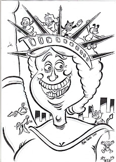
TIME MACHINE color update:

I CAN'T TAKE ALL THE CREDIT FOR THIS ONE, as the very effective coloring on this drawing was put together by highly-experienced Rich Skipworth, who has mastered the art and craft of digital color to a high degree. The first thing I notice here is the sheer restraint of color application compared to my efforts thus far here, the color has been pared back to more practical and direct effect, with only minimal highlighting and shading, and the design certainly stands out a lot more forcefully, with better impact. I reckon I've overdoing the shading and gradient tones especially in my own stuff, I just need to hold back a bit on this score: the elements stand out a lot more easier on the eye using the more restrained methods that Rich has done here. Elaborate details can still be added though: that bevelled, 'carved-out-of-metal' 'TIME MACHINE' writing is an excellent touch which helps to inject some realism into the absurdist larkings. I will have to rethink my...

